Visitor Experience Plan / Wayfinding Evaluation + Plan / Map + Brochure
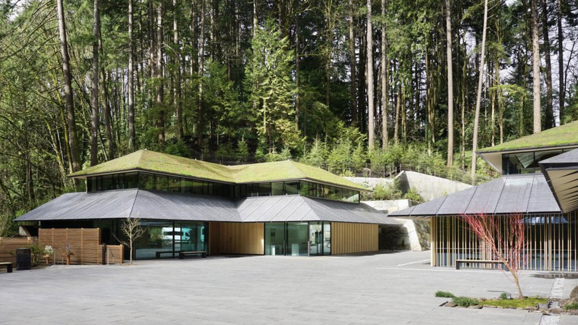
In 2017, the Portland Japanese Garden opened a major expansion—which led to an influx of new visitors—and new challenges related to wayfinding, behaviors, and cultural understanding.
The Garden hired us to complete a wayfinding evaluation and plan. They knew that their visitors were finding themselves “confused, uncertain and even lost.” And wanted to know why and what to do.
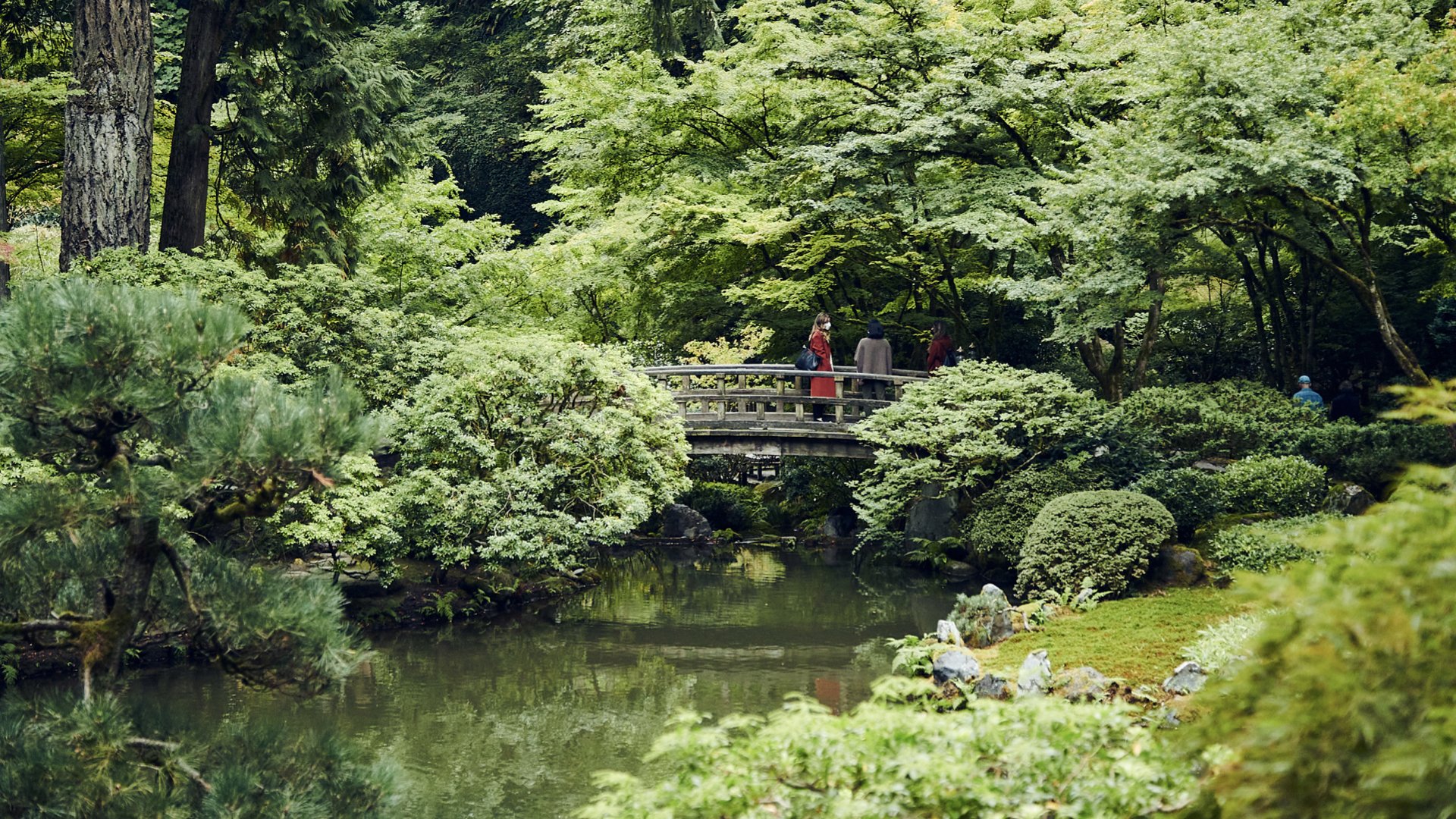
We took a holistic, human-centered approach and created a robust Visitor Experience Plan to improve and build upon their existing wayfinding, interpretation and services.
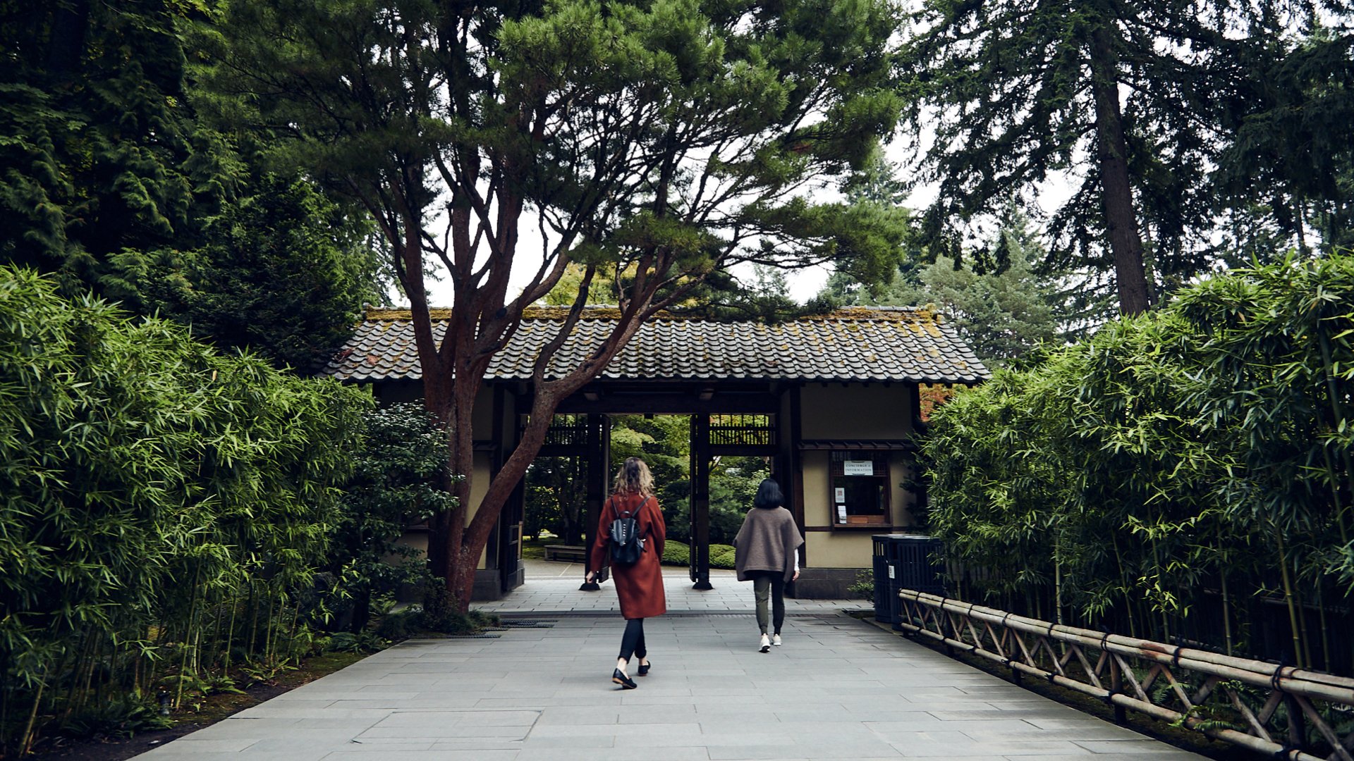
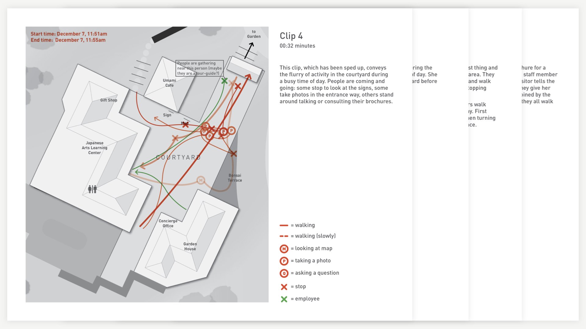
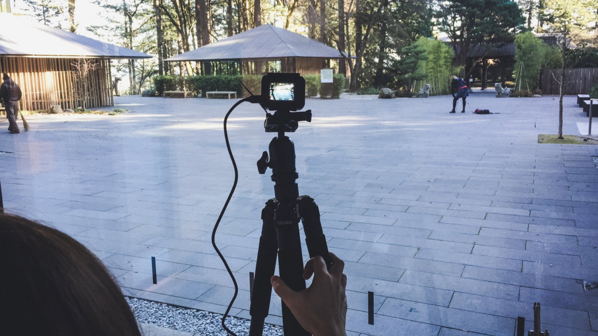
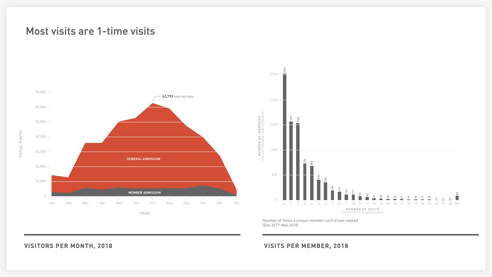
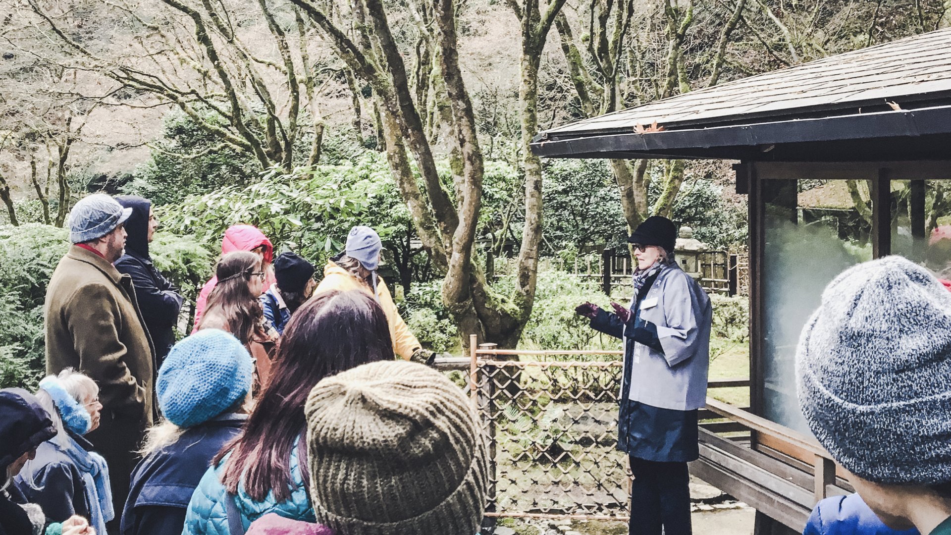
To understand visitor challenges, we studied their behavior through data analysis, spatial mapping, and stakeholder and visitor interviews.
Insights from the research formed a foundation to identify opportunities to improve visitor experiences.
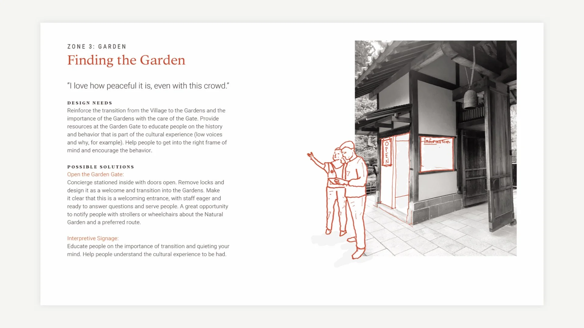
The Visitor Experience Plan identified 16 key moments and associated opportunities ranging from signage and graphics to new visitor services, scripts and amenities.
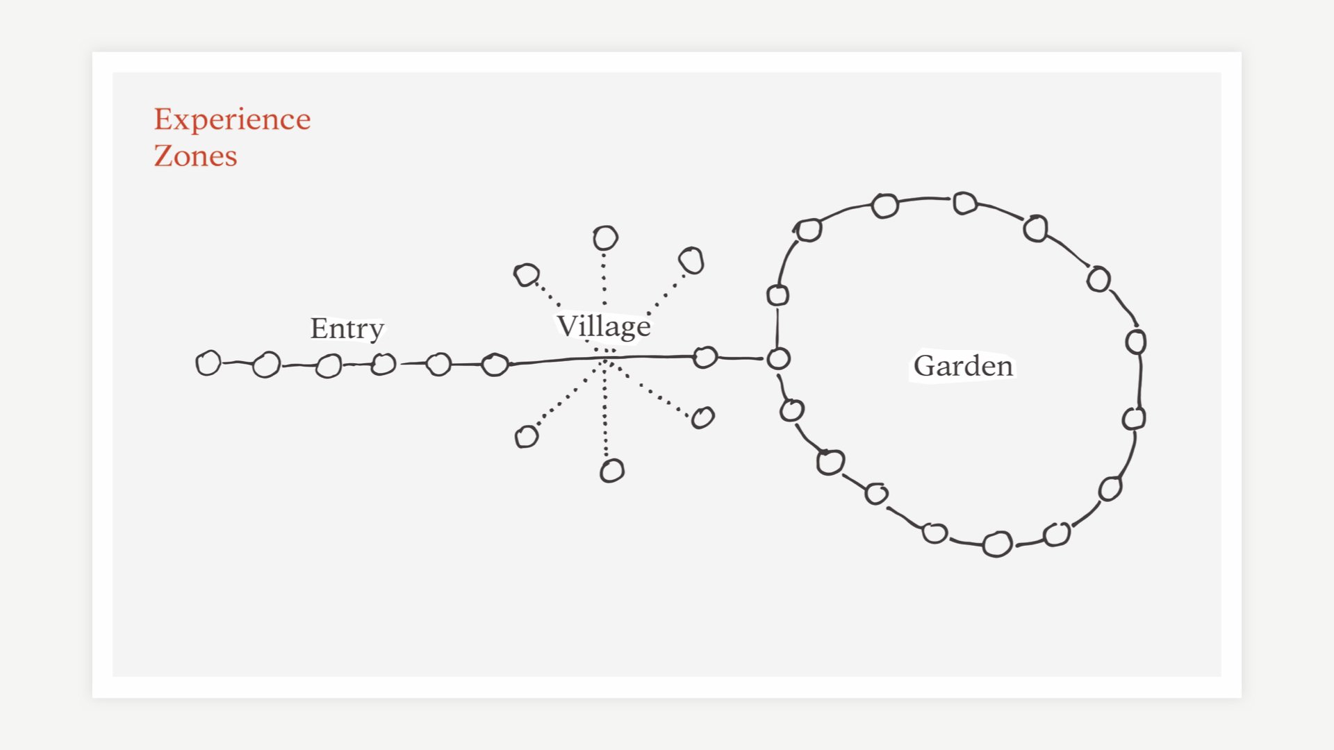
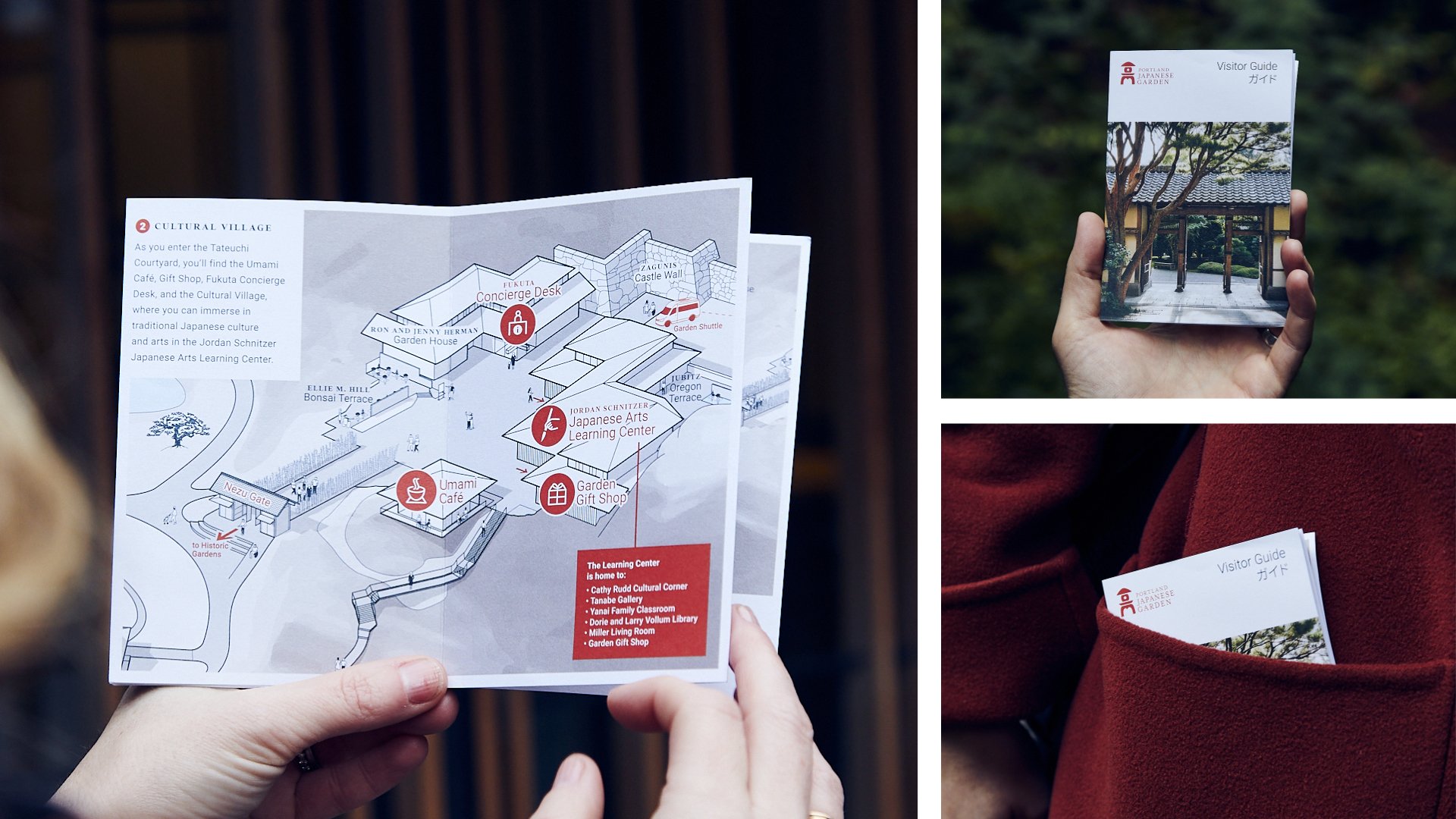
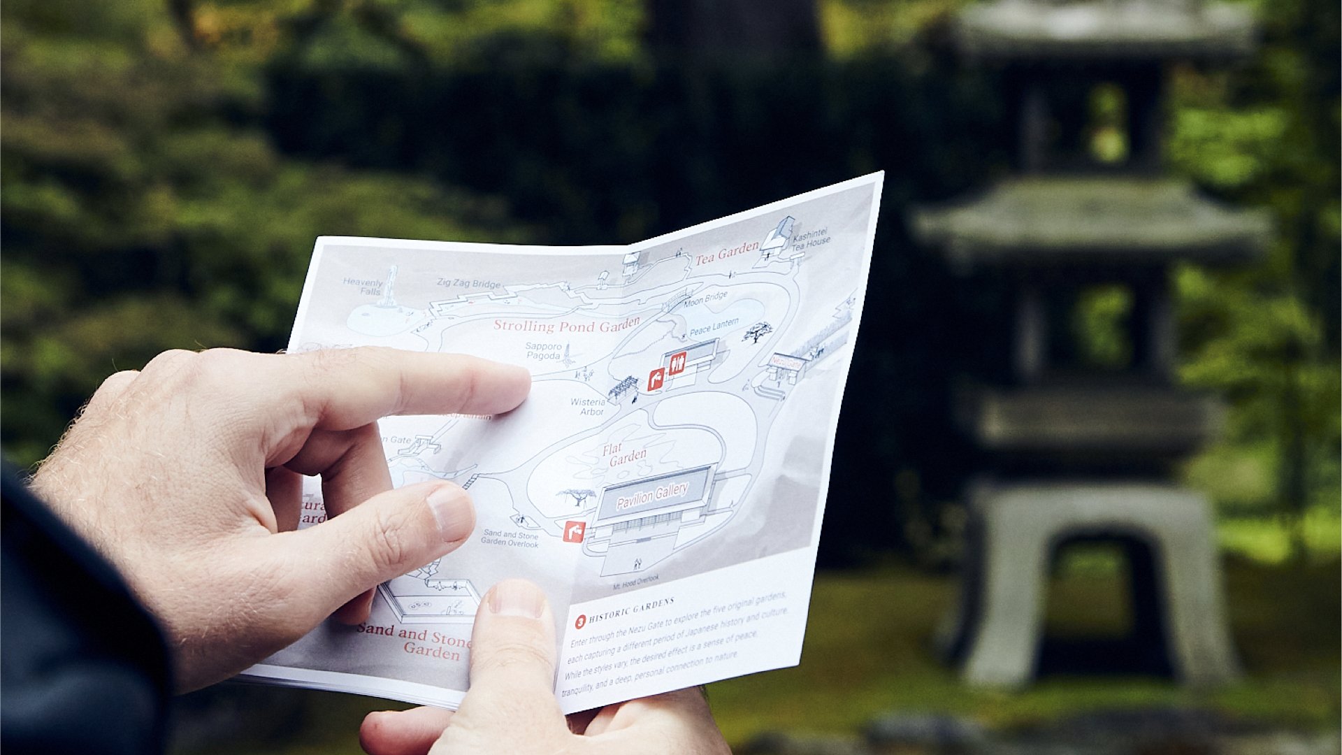
One foundational insight was that many visitors did not have a clear mental model of the garden. We designed a new map and guide to establish clear expectations and experiences for the Garden’s three primary zones: the Entrance, the Village and the Historic Gardens.
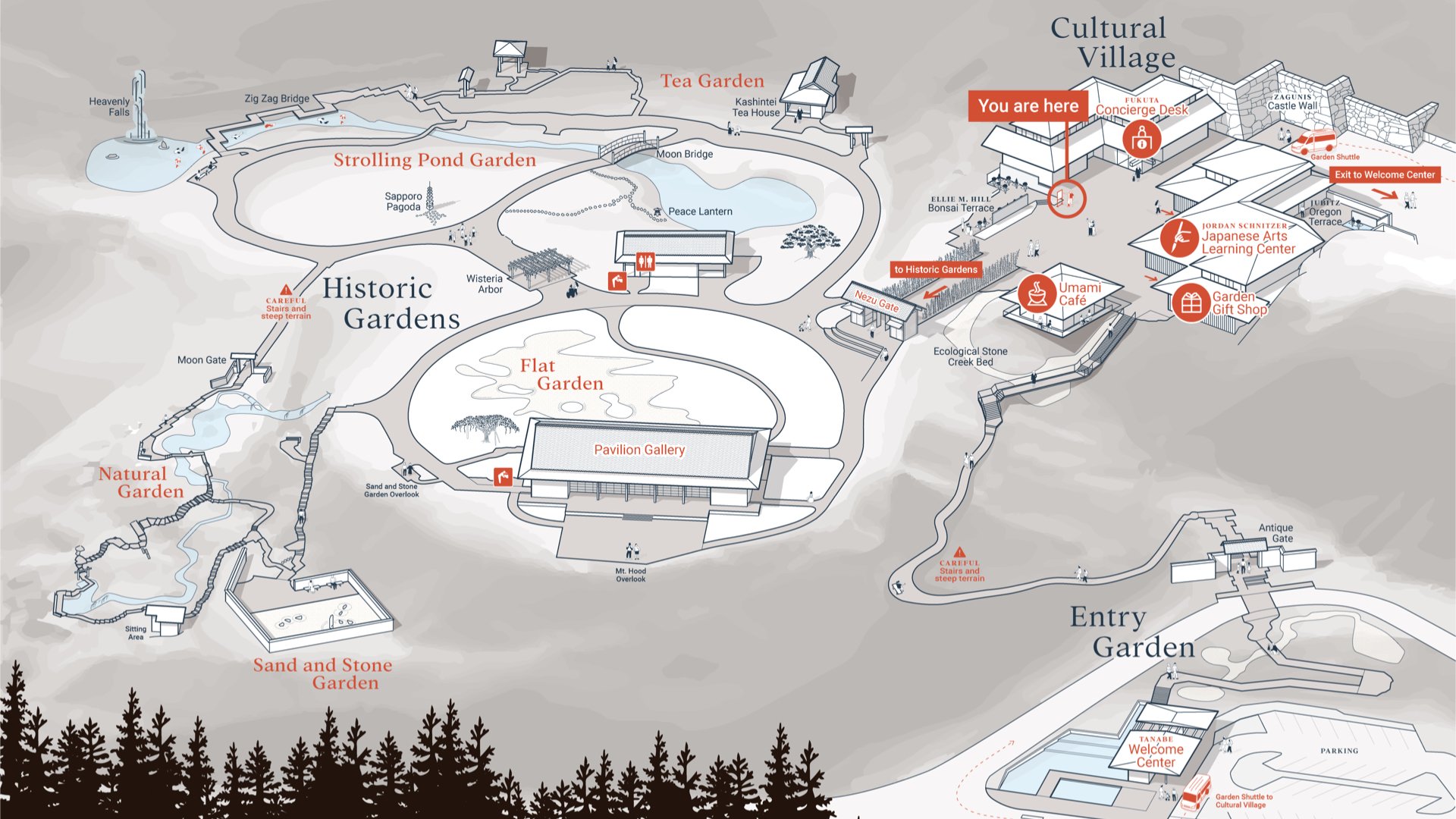
The map is drawn in perspective with people and nature illustrated to help people intuitively understand their physical place within the Garden.
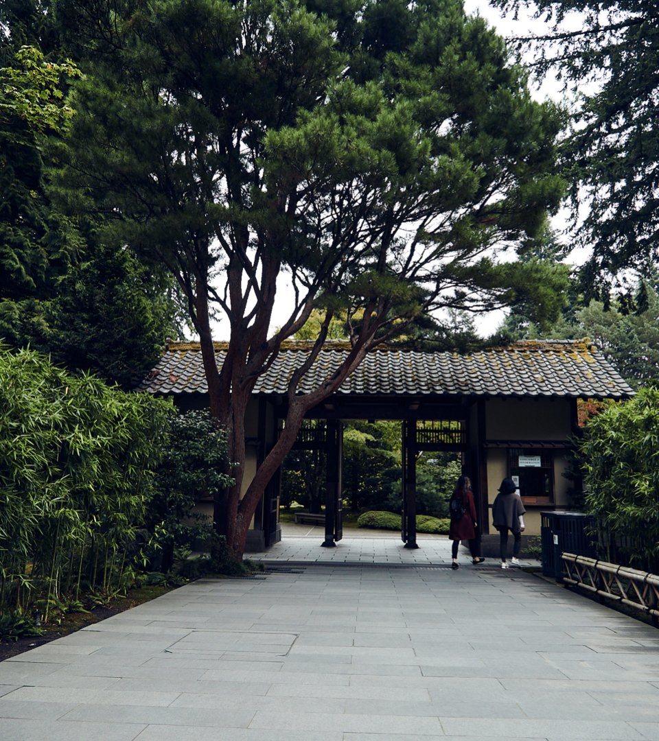
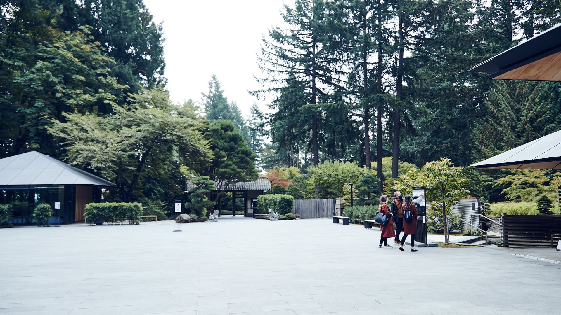
We worked with the Garden to move their existing map sign across the courtyard so that it draws visitors within view of the entry gate to the historic gardens—and so that the map is oriented consistently with the landscape itself.
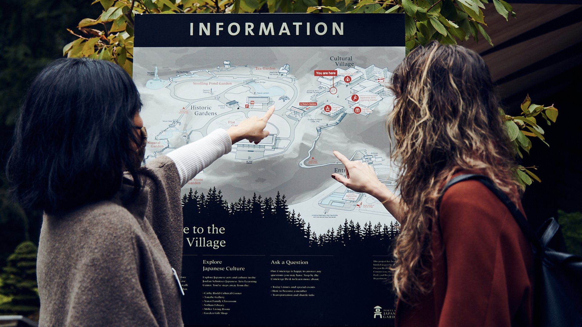
The new design focuses on landmarks—rather than vegetation—to help visitors find their way. Illustrations of koi swimming in the pond and people wandering the paths, encourage visitors to jump in and explore—while subtly suggesting garden etiquette.
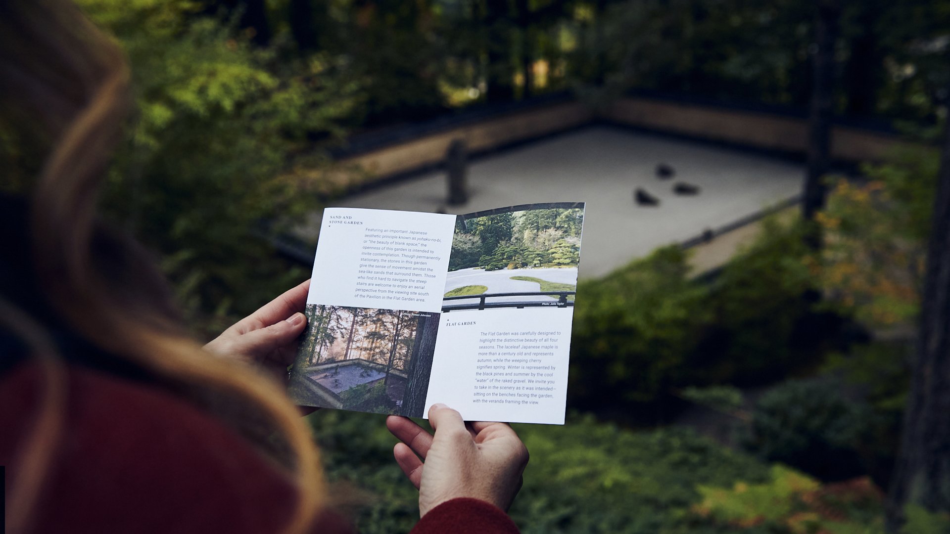
More than just maps or signs, the Visitor Experience Plan identified the best solutions to reinforce an understanding of the Garden and Japanese culture. For example, reinstating visitor services at the Historic Garden gate, and investing in the brochure as a tool for self-guided tours.
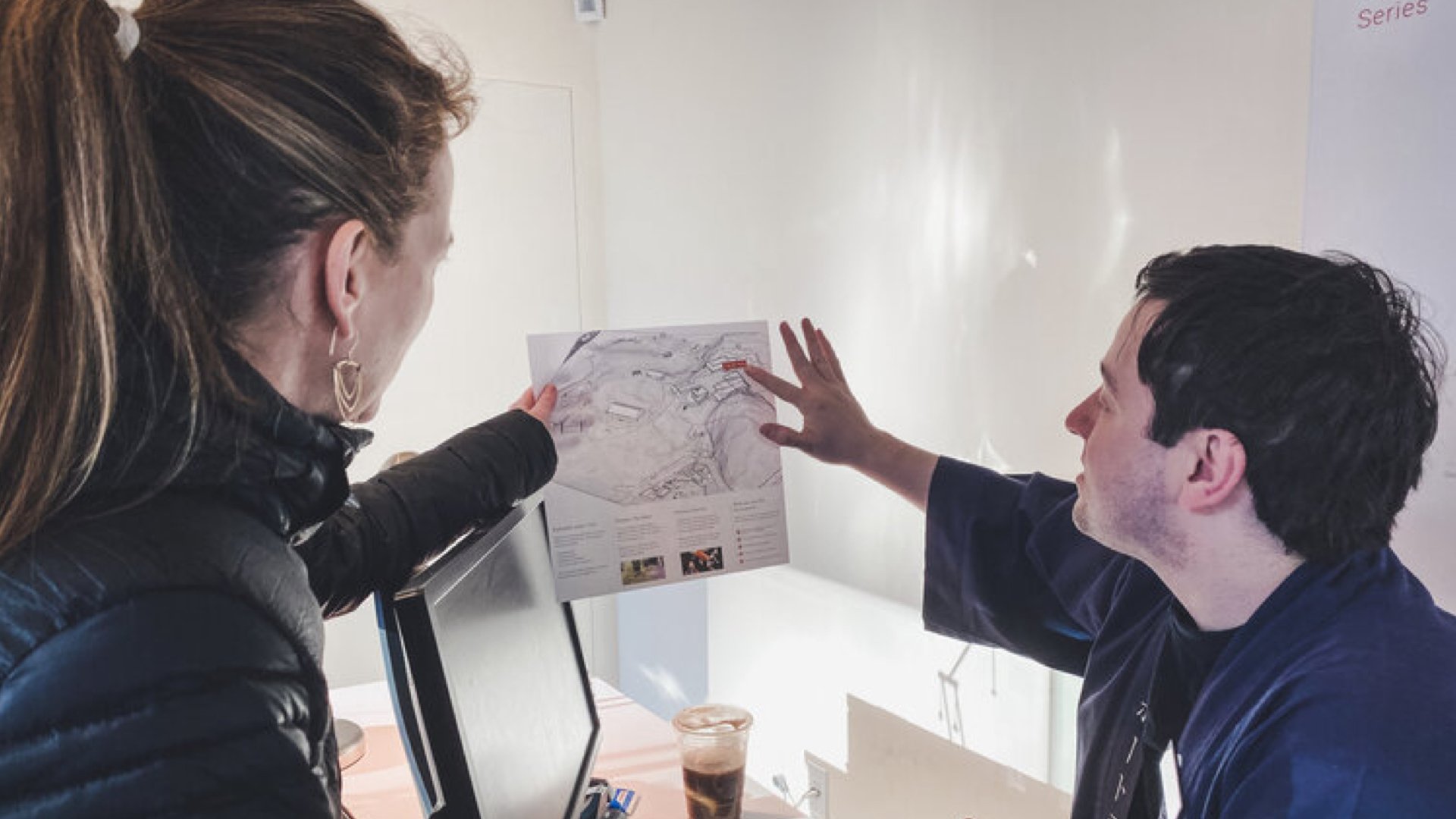
Throughout the process, we collaborated closely with staff and volunteers to test ideas, mock-up solutions and measure the effectiveness.
