Brand Identity / Graphic Design / Map Design
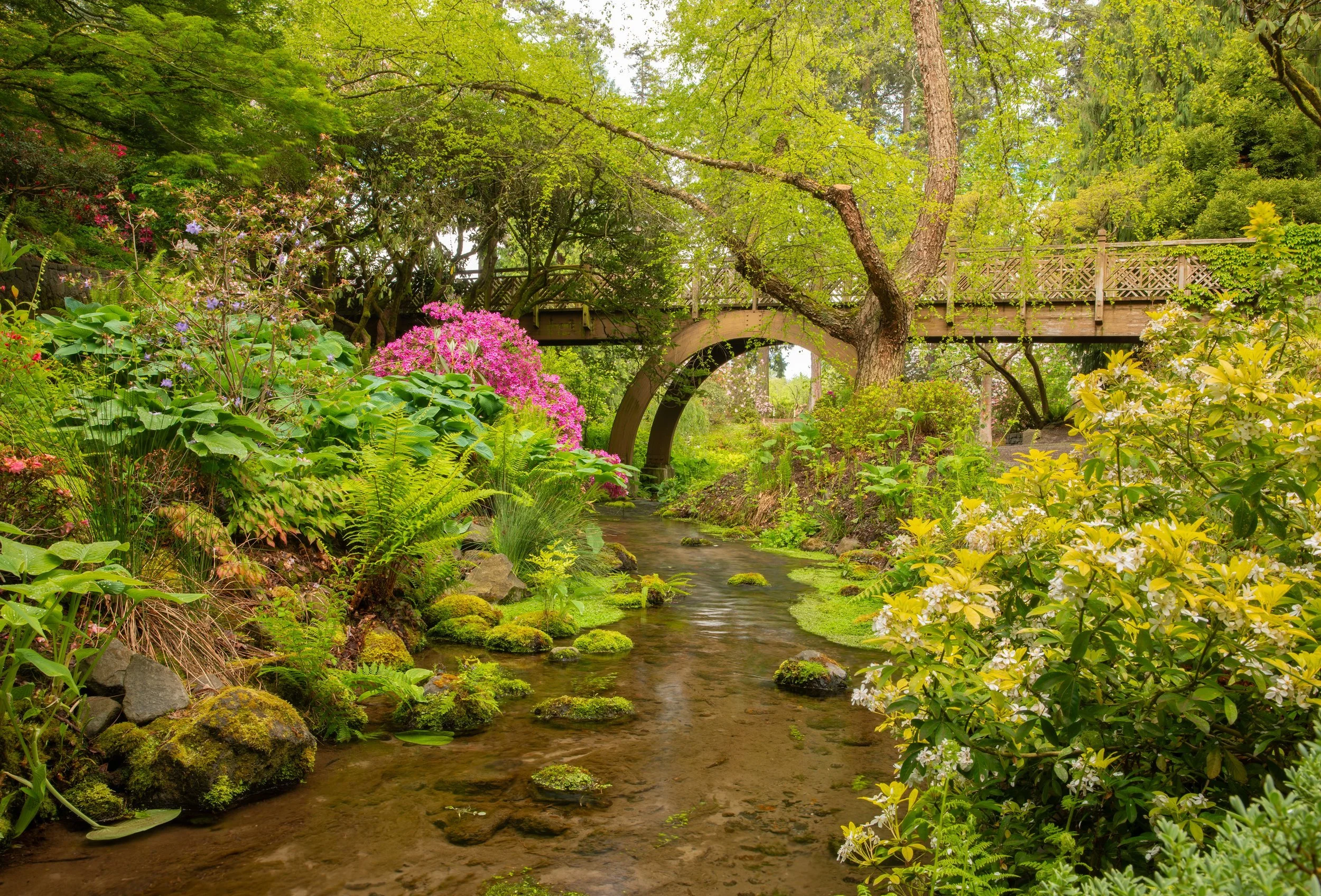
Crystal Springs Rhododendron Garden is a cherished Portland botanical garden featuring over 2,500 rhododendrons, azaleas and companion plants on the shores of a spring-fed lake. As the Garden approached its 75th anniversary, they hired us to create a new brand identity.
But first, they desperately wanted a new map.
We spent a season observing the garden, testing a prototype map and gathering feedback via a survey.


Inspired by the learnings from the prototype map and getting to know the garden and its visitors, we dove into the brand design. We started with the logomark—seeking to express the Garden’s unique spirit of place.
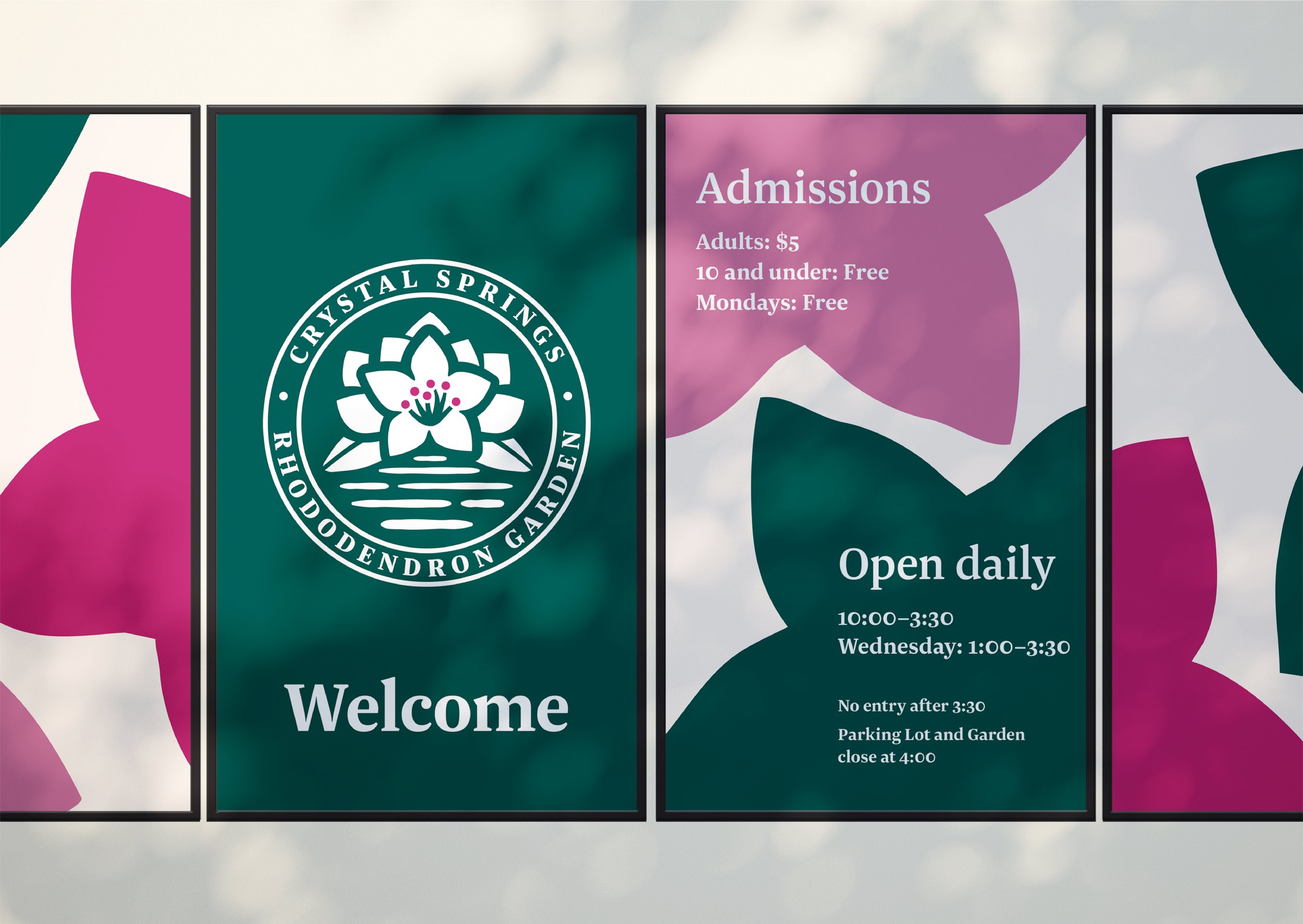
The final design, born out of dozens of iterations, expresses the Garden’s two primary defining characteristics: rhododendrons and water.
The logomark’s badge features a cluster of rhododendrons, including the flower’s stamen and two evergreen leaves. The arch shape of the flowers and leaves mimics the Garden’s iconic High Bridge and hovers over calm water—a distinguishing characteristic and namesake of the Garden.
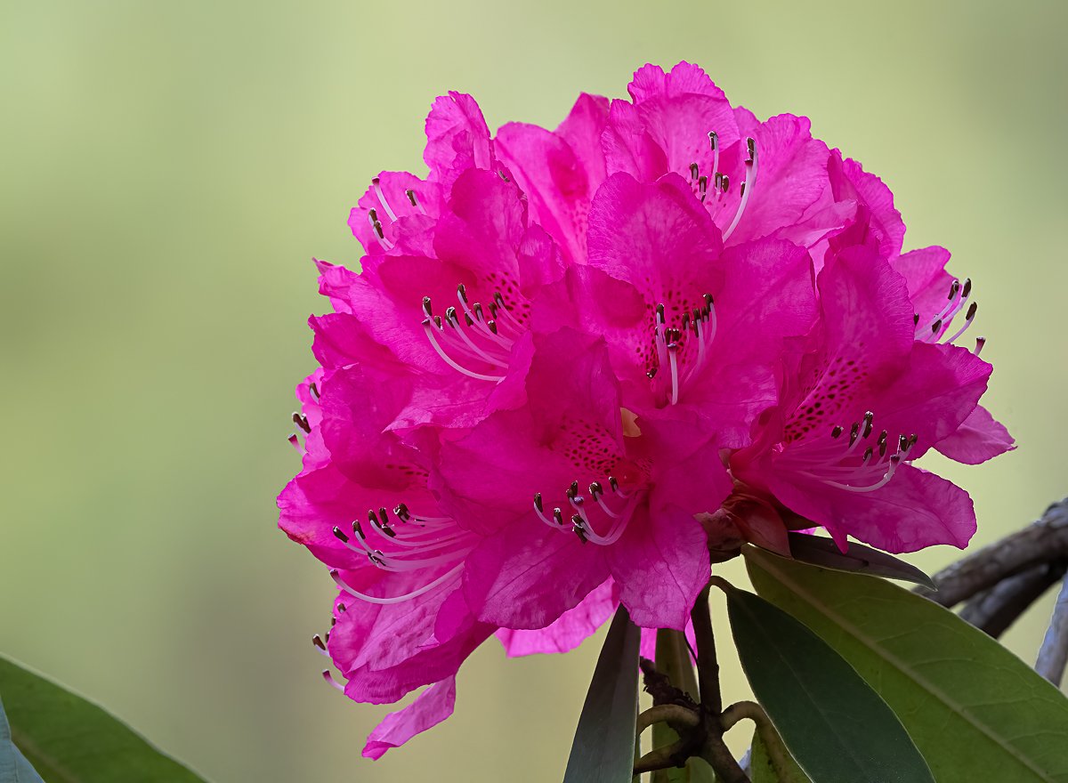

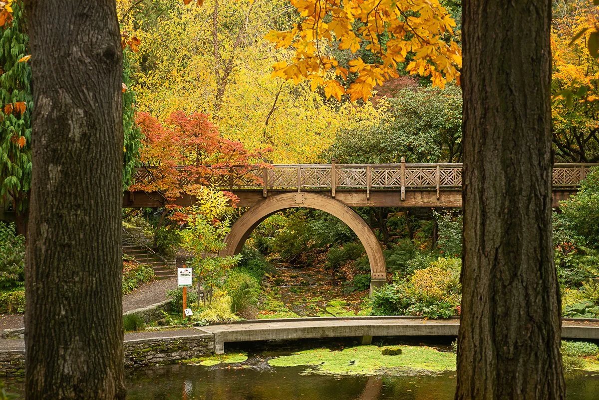
The brand colors are directly inspired by rhododendrons and their signature colors. From the evergreen base color to bright pops of magenta and muted lavenders, these colors can either blend in or standout depending on how they're applied.
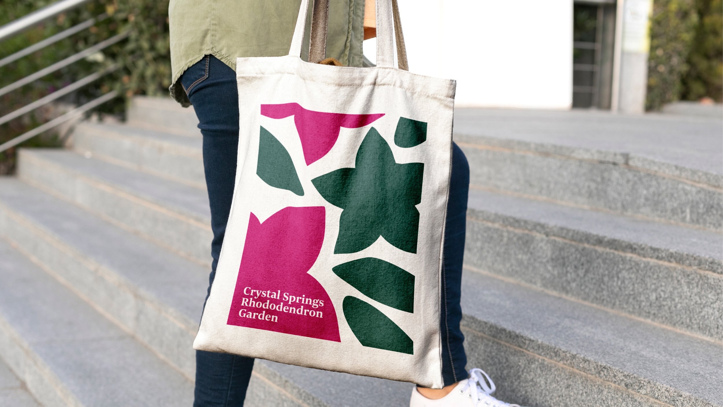
The brand system balances the garden’s traditional heritage (it’s home to the nation’s first Rhododendron Society) while making bold, contemporary moves with pattern, scale and the use of color.
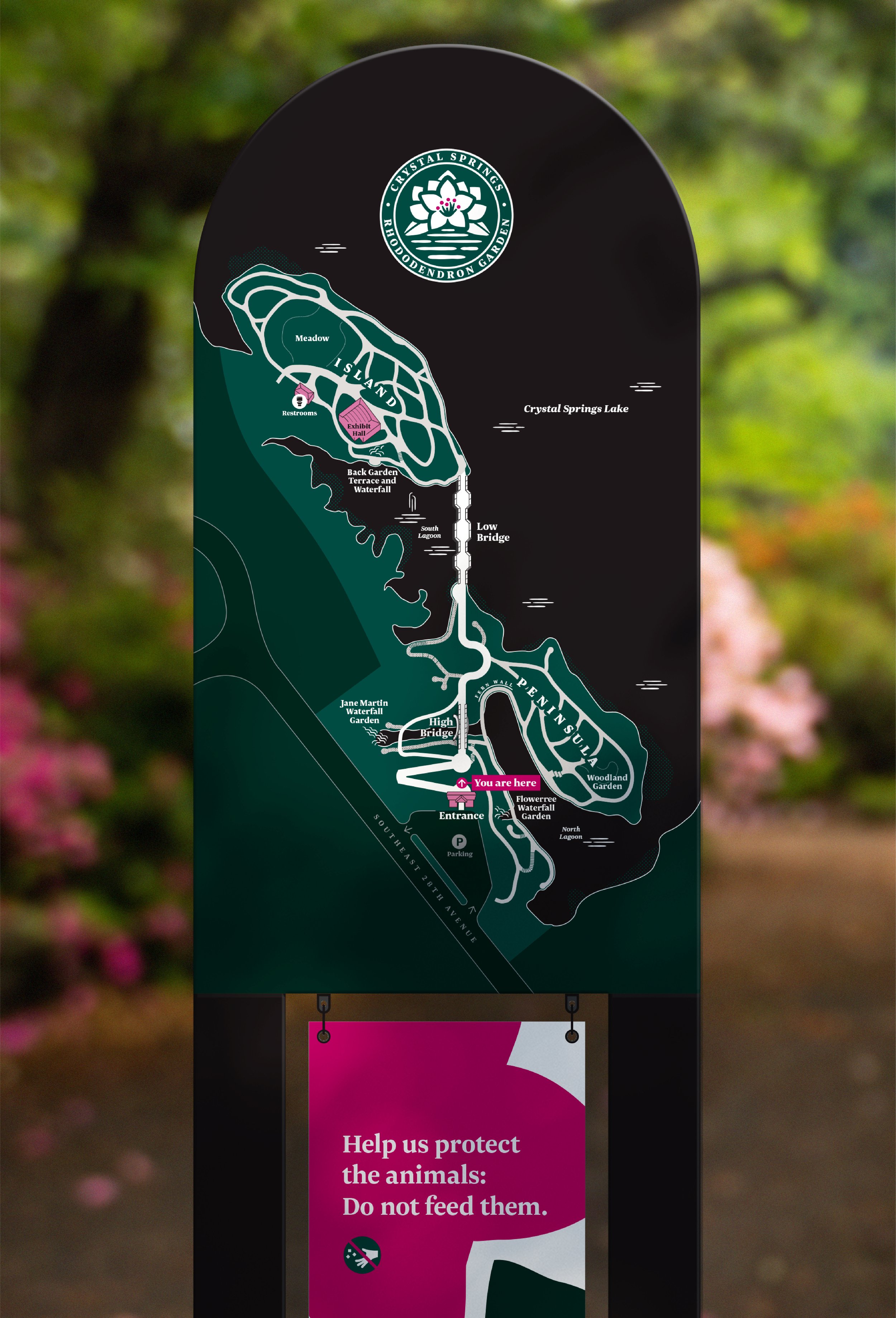
Based on the learnings from the map prototype, we updated the map and integrated the new brand. It emphasizes landmarks and key destinations (rather than the plants themselves) to help guide people intuitively.

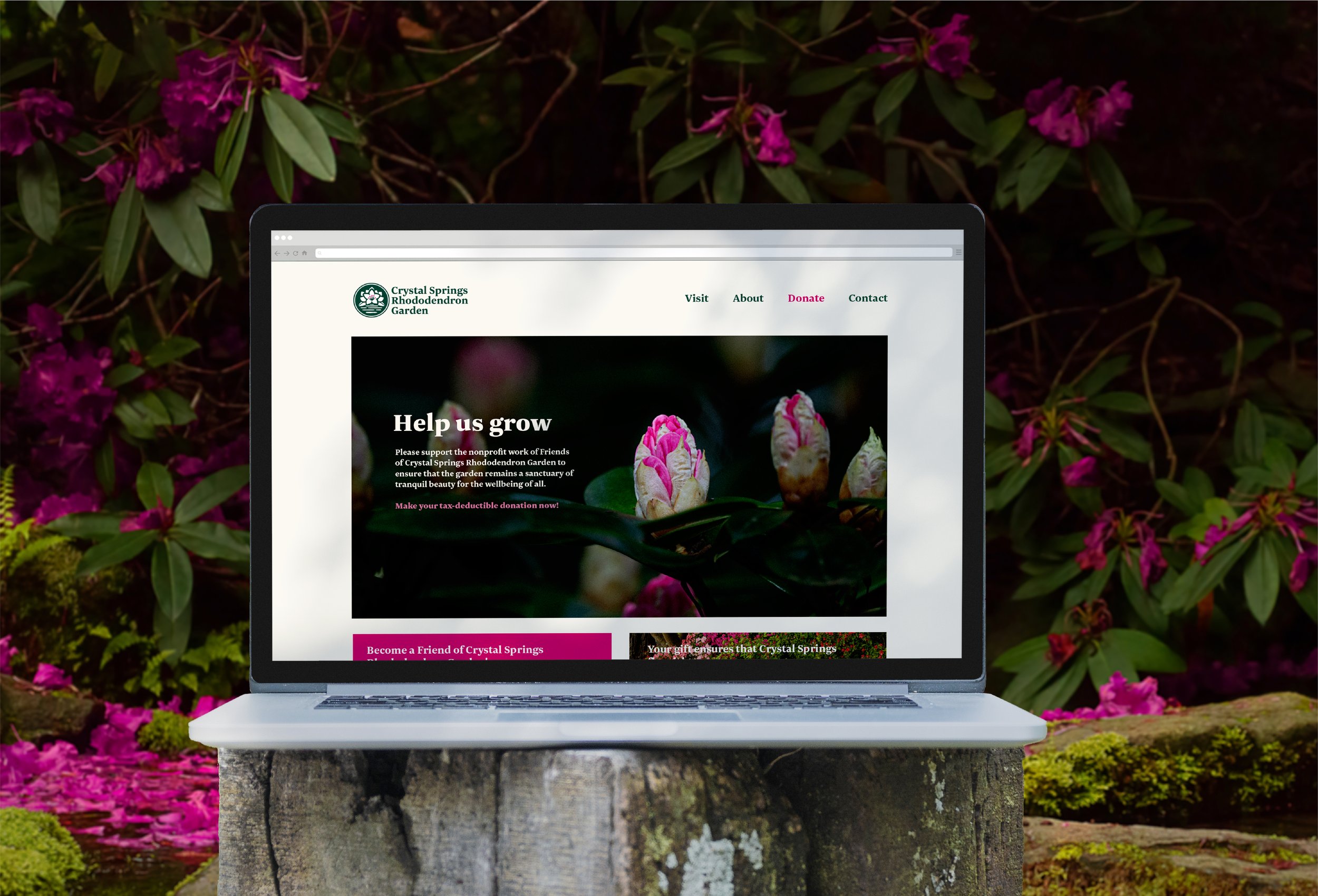
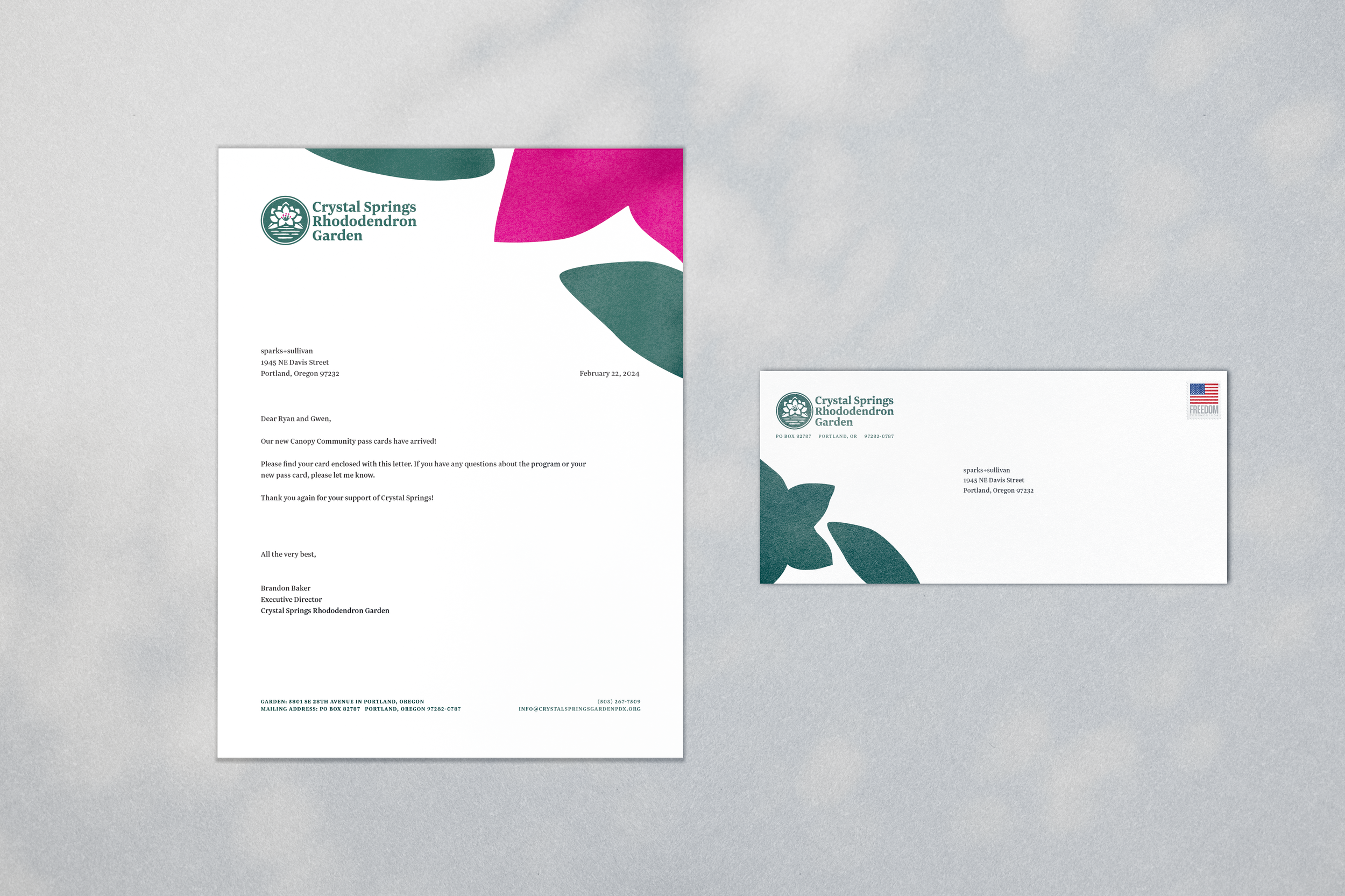
We applied the brand to several touchpoints including the garden’s website, social media badges, and environmental graphics. Over the next year, the brand will continue to roll-out, in preparation for the Garden’s 75th anniversary.
