Consumer Insight Research / Brand Identity / Launch Strategy / Website Design
Bodies come in all shapes and sizes.
Socks should too.
We worked with iconic sock brand Darn Tough to launch a new product and brand focused on wide-fitting socks, Wide Open. We led consumer insight research, brand strategy, design, and website design, helping bring this innovative new product to an underserved market.

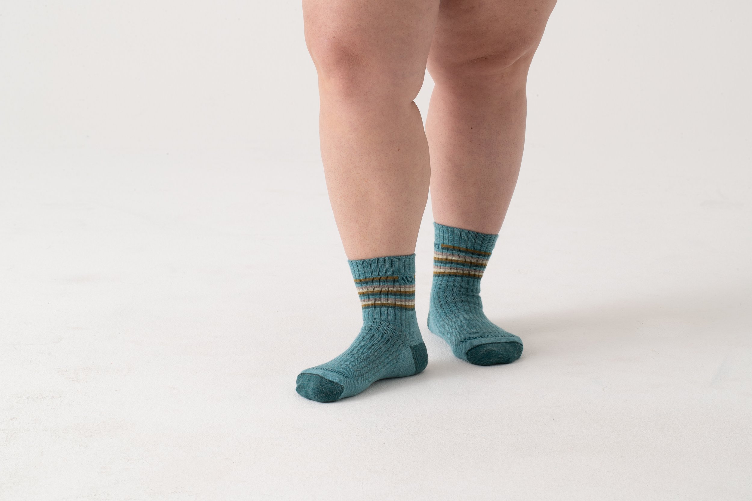
Nearly every sock on the market is designed for people with narrow legs and feet, which leaves tens of millions of people stuck (literally) in ill-fitting socks. That’s why Wide Open was created: to make the best everyday socks for wide legs and feet.

We worked for over a year with the innovation and executive team at Darn Tough , starting with a deep dive speaking to people to identify and articulate meaningful insights. The market need and opportunities we uncovered were so great Darn Tough decided to launch a new brand: Wide Open.
Darn Tough developed the product in-house and hired us to take it to market. We tested messaging and brand perceptions through consumer research, created the brand identity and led launch strategy—including writing press releases, recruiting and directing photoshoots, designing the website and product packaging and helping hire their first full-time employee.
“Sock patterns and standards don’t exist for wide legs and feet, so we’re creating them,” says Ric Cabot, President and CEO. The result? The best fitting sock for anyone who needs more room for their foot, ankle, or calf.

We heard from hundreds of people and confirmed what we already knew: too many people are hacking their socks to fit—from buying too big, to literally cutting the cuffs with scissors. Worst case, some just live with the pain of socks fitting poorly. When shopping for wide socks in the marketplace, people had limited colors, sizes, and the poorest of quality options.
In the process of building the brand, we found that foot forms aren’t made wide enough, so we had to make them. We found that modeling agencies simply categorize models as Plus, not acknowledging that wide legs, ankles, and calves are actually on all sizes of bodies. We knew that we had to prove to our customers that we were designing for them and decided to show all the product on-body featuring confident poses and using video to address fit concerns.
The brand emphasizes confidence, craft and quality—key characteristics of the product itself and the experience of wearing it.


Brand colors rely on neutrals to best offset the design of the socks. The yellow color specification matches highway or construction safety yellows and emphasizes the utilitarian nature of the brand and serves a function to draw attention to important brand messaging. Likewise, the typography borrows from industrial type to emphasize function and durability.
After exploratory research to define the opportunity, we had 10 months to make and launch the brand and e-commerce experience. The first month exceeded all expectations by doubling forecasted sales, reaching customers in every state, and receiving overwhelmingly positive reviews.
Special thanks to the dedicated and passionate partners who contributed to this work.
Award Recognition
Industrial Designers Society of America (IDSA) International Design Excellence Awards (IDEA): Bronze


