Brand Identity / Brand Experience / Graphic Design
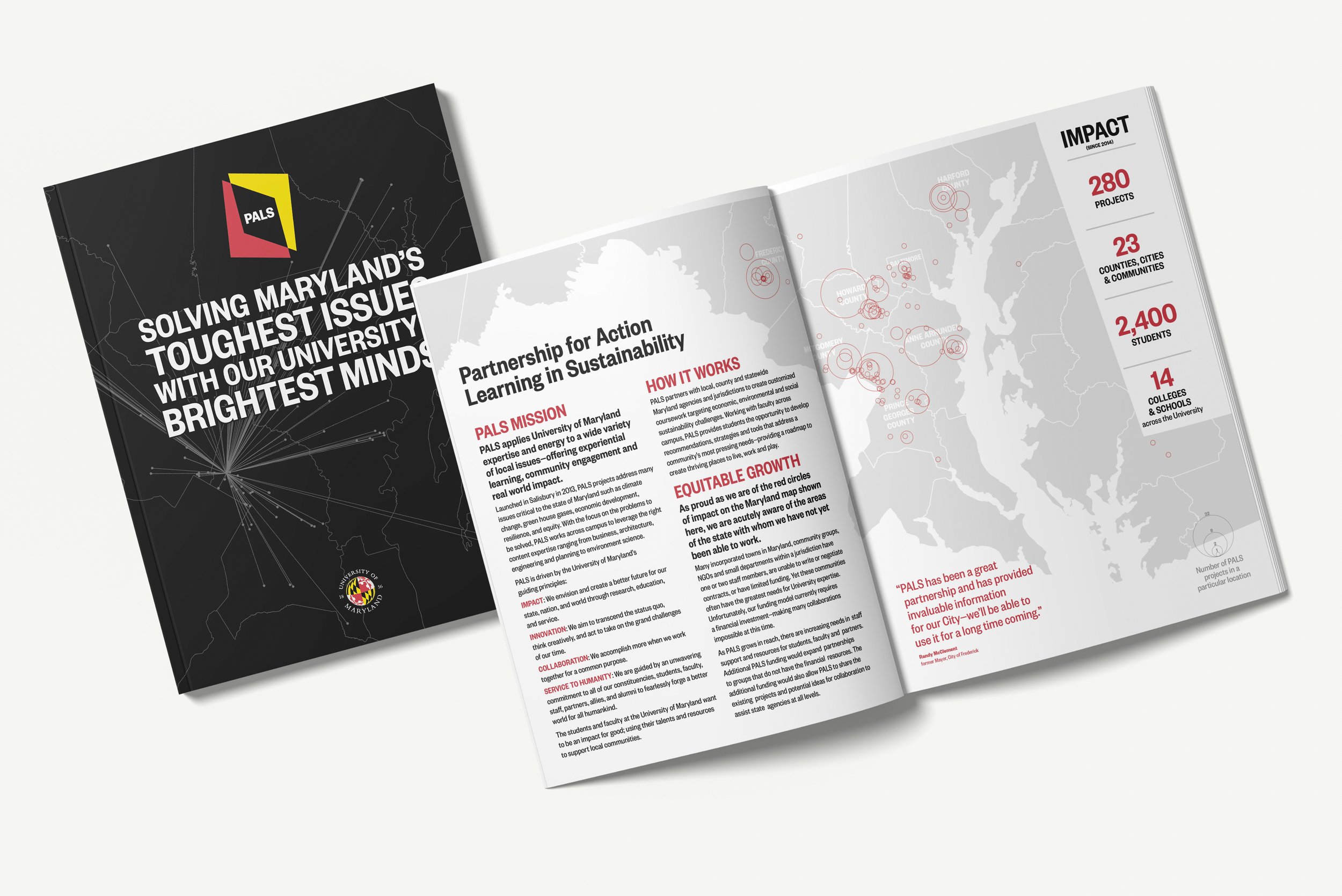
Partnership for Action Learning in Sustainability (PALS) applies University of Maryland expertise to a wide variety of local issues across the state of Maryland—offering experiential learning, community engagement and real world impact.
With its increased success and growth—it's the largest such program in the country—PALS wanted to communicate more consistently to partners and participants by creating a comprehensive brand identity system.


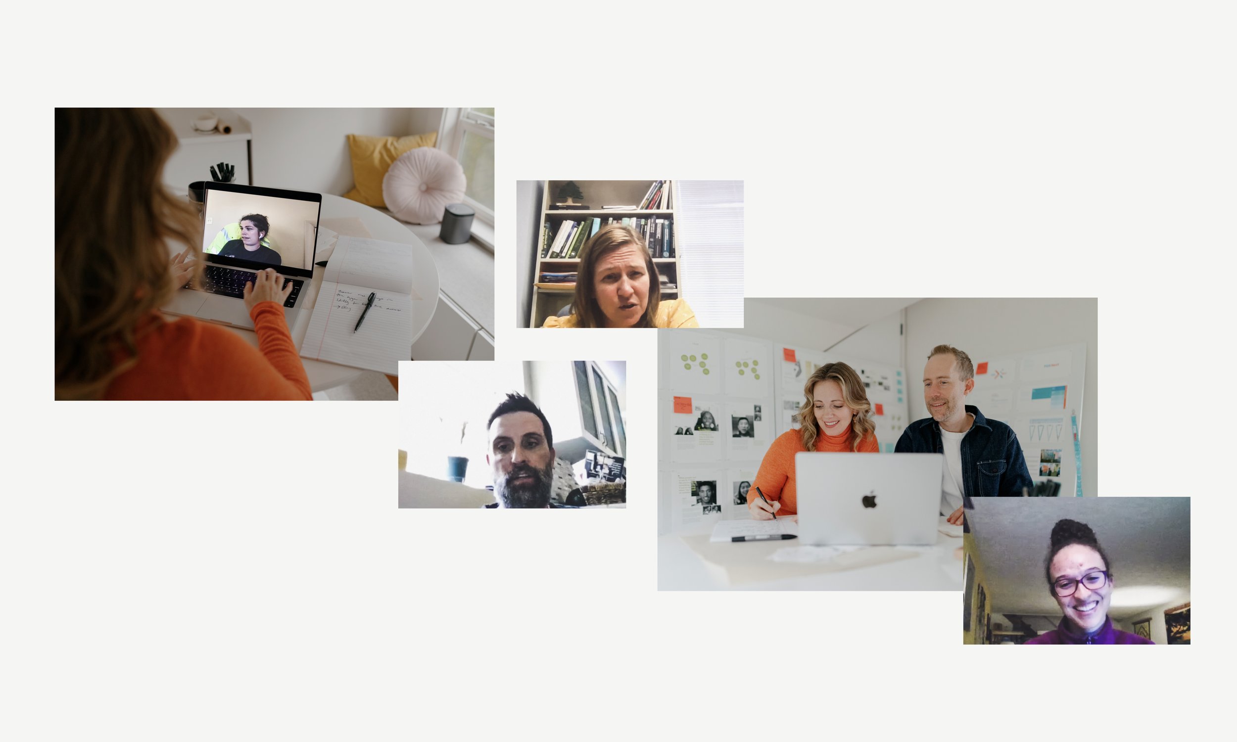
To inform a new visual identity and overall brand experience for PALS, we took a human-centered approach: observing existing PALS courses, talking to partners, faculty, staff and students. This research informed the brand identity and key moments to elevate the PALS experience.
We wanted the brand system to sit comfortably within the visual language of both the University and the State of Maryland.
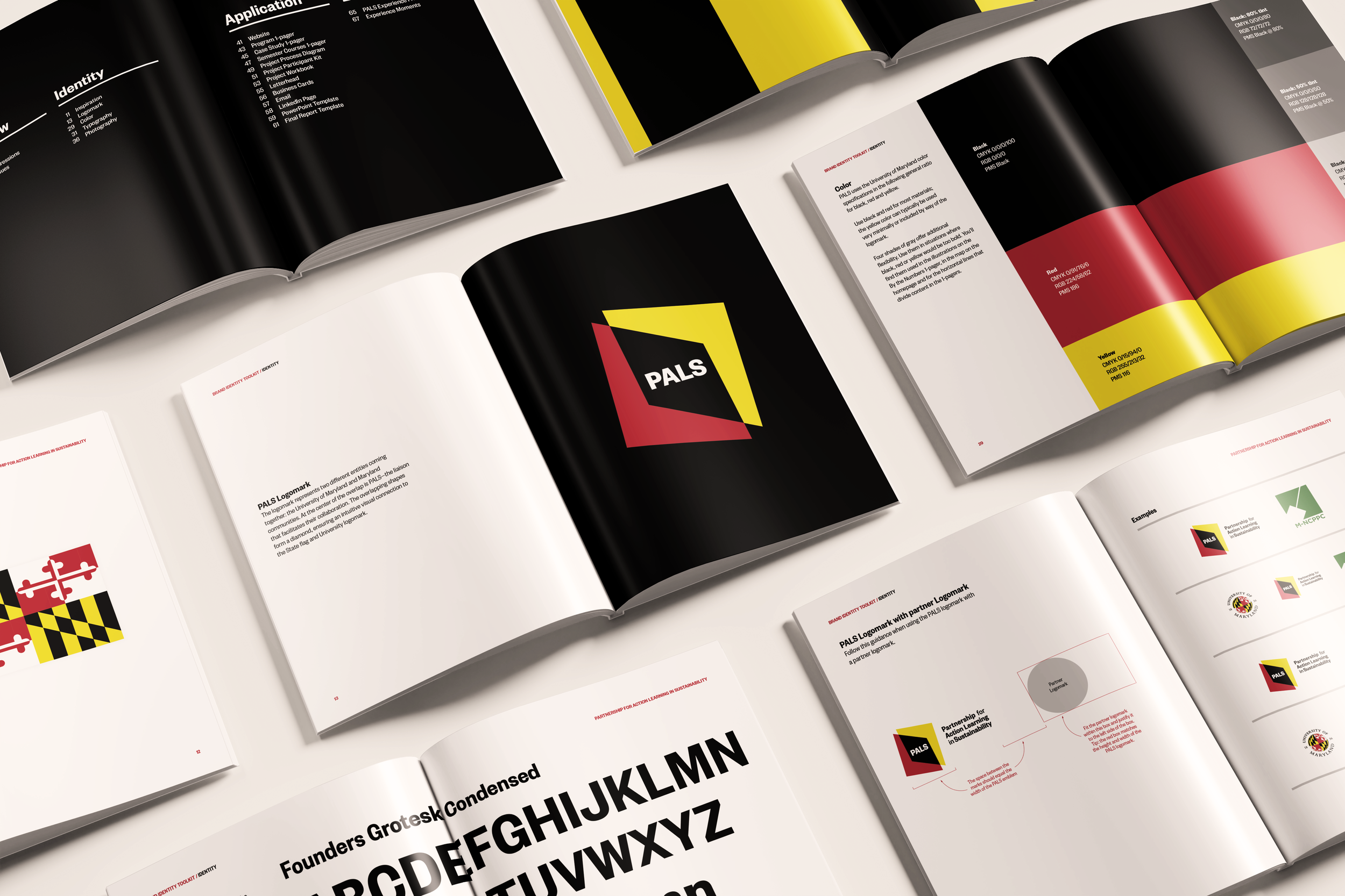
The black and yellow portion of the Maryland state flag was used during the Civil War to represent “union”—a fitting point of departure for the PALS logo which represents collaboration and partnership.

The logomark represents two different entities coming together: the University and Maryland communities. At the center of the overlap is PALS—the liaison that facilitates their collaboration.
The overlapping shapes form a diamond, ensuring an intuitive visual connection to both the State flag and University logomark.
From there, we built a comprehensive brand identity system.

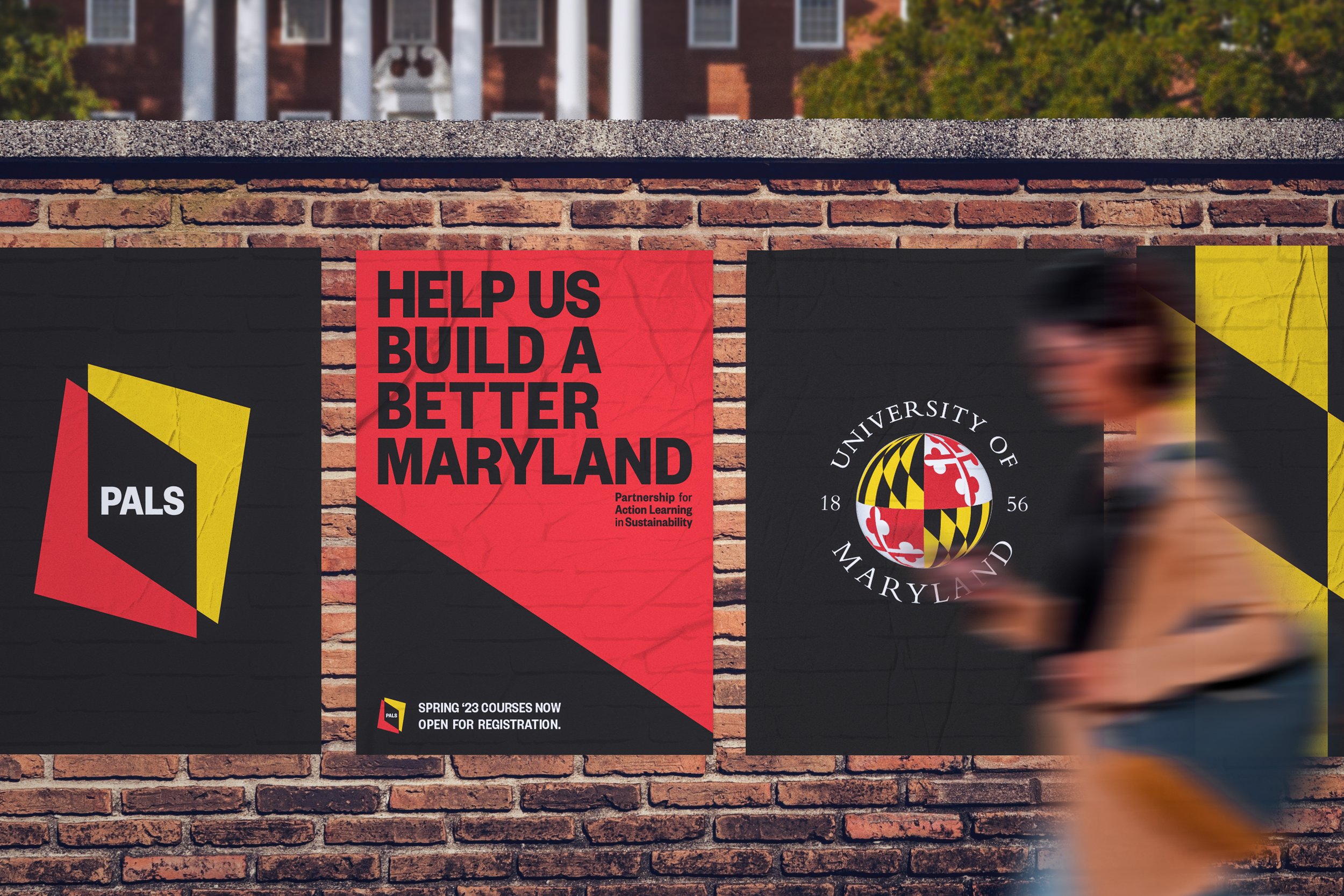
To help inform where to apply the brand, we created a brand experience framework—and designed elements for key communication touchpoints.


Special thanks to the dedicated and passionate partners who contributed to this work.
Award Recognition
University & College Designers Association (UCDA)
UCDA Design Awards: Silver


